Introduction to Colour Symbolism in Indian Sacred Spaces
India’s grand temples, serene ashrams, and vibrant spiritual centres are sanctuaries where colours play a profound role, shaping the spiritual and sensory experience for devotees and seekers alike. Across the length and breadth of Bharat, colours are not just decorative elements but are deeply interwoven with local traditions, Vedic beliefs, and ancient philosophies. In these hallowed spaces, every hue—from the saffron drapes fluttering outside an ashram in Rishikesh to the intricate blue mandalas adorning South Indian temple ceilings—carries a purpose rooted in symbolism and cosmic harmony. The choice and placement of colours are guided by both tradition and Vastu Shastra, the ancient Indian science of architecture. These colour selections influence energy flows, invoke specific deities, and create atmospheres that foster devotion, meditation, or celebration. Whether it is the cool white marble of Jain temples signifying purity or the fiery reds in Devi shrines symbolising Shakti, each colour in sacred spaces across India holds a unique meaning. By understanding these colour codes through the lens of Indian customs and Vastu principles, we can appreciate how spiritual environments are thoughtfully curated to elevate the soul’s journey.
2. Popular Colours in Grand Temples and Their Cultural Meanings
Indias grand temples are not just architectural marvels but also vibrant canvases, painted with colours deeply rooted in the countrys spiritual and cultural psyche. The use of specific shades is never arbitrary; every hue carries a meaning shaped by centuries of tradition, local customs, and the principles of Vastu Shastra. Below, we examine some of the most frequently used colours in major Indian temples and their significance as interpreted by devotees and priests across different regions.
Commonly Used Temple Colours and Their Significance
| Colour | Vastu & Spiritual Meaning | Cultural Reference |
|---|---|---|
| Saffron (Kesariya) | Symbolises purity, sacrifice, and piety; promotes spiritual upliftment. | Seen on temple domes, flags, and priest robes; associated with renunciation (Sannyas) and revered saints. |
| White (Safed) | Denotes peace, purity, cleanliness; believed to attract positive energies. | Marble temples like those in Rajasthan; white clothing for priests during rituals in South India. |
| Red (Lal) | Represents power, strength, and fertility; invokes the goddess Shakti. | Red sindoor on idols of Durga or Hanuman; red cloth offerings by devotees. |
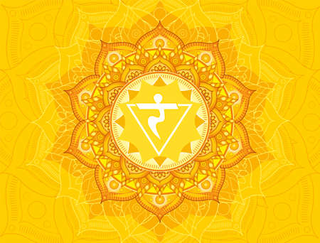
| Yellow (Peela) | Signifies knowledge, wisdom, auspiciousness; linked to prosperity and growth. | Sandalwood paste on deities; yellow decorations during festivals like Basant Panchami. |
| Blue (Neela) | Associated with depth, vastness, and cosmic power; calms the mind. | Blue idols of Lord Krishna or Vishnu; blue tiles in South Indian temple gopurams (towers). |
| Green (Hara) | Stands for balance, life force, and harmony with nature. | Green garlands and floral decorations during harvest festivals; sacred groves within temple complexes. |
Cultural Interpretation by Devotees and Priests
The choice of colours in temples is often guided by regional practices. For instance, in Tamil Nadu’s Dravidian temples, vibrant reds and yellows dominate the sanctum sanctorum to evoke divine energy. In contrast, Jain temples in Gujarat favour white marble to reflect ideals of non-violence and purity. Priests interpret these colours as conduits for specific deities’ blessings: saffron for Lord Ram or Hanuman’s valor, blue for Lord Krishna’s infinite compassion. Devotees too internalise these meanings—wearing white on pilgrimage for mental clarity or tying red threads for protection—integrating temple colour symbolism into daily religious life.
3. Colour Choices in Ashrams and Spiritual Retreat Spaces
When we step into an ashram or a spiritual retreat space in India, the immediate sense of calm and simplicity is often shaped by the thoughtful selection of colours. Unlike grand temples, where vibrant hues might celebrate divinity and myth, ashrams prioritise subtlety and serenity, reflecting the ascetic values at their core. The preference for certain colours within these sacred spaces is rooted not only in spiritual practices but also in regional influences and cultural symbolism unique to India.
The Spiritual Significance of Colour Palettes
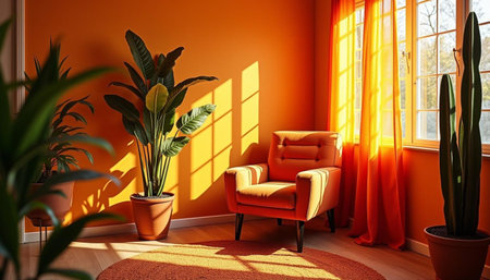
Ashram interiors commonly feature shades such as white, off-white, beige, and soft earth tones. White symbolises purity, detachment from material distractions, and a focus on inner peace—qualities essential to spiritual seekers and yogis. Such colour choices foster a meditative atmosphere that encourages silence and introspection. In some regions, saffron or ochre accents are incorporated, aligning with the traditional robes of sannyasis (ascetics) and signifying renunciation and devotion.
Regional Influences and Traditional Practices
The Indian subcontinent’s vast diversity influences the colour schemes in ashrams across states. For example, ashrams in Kerala might use muted greens or natural wood finishes to harmonise with lush surroundings, while those in Rajasthan may incorporate earthy reds or yellows reflecting desert landscapes. Local materials—lime plaster, mud walls, or indigenous stone—often dictate the base palette, rooting these sanctuaries firmly in their environment while remaining mindful of Vastu Shastra principles.
Vastu Alignment for Peace and Well-being
Adherence to Vastu Shastra further guides colour selection within ashrams. North-facing meditation halls are often painted light blue or green to enhance tranquillity and healing energies, while south-facing spaces may use warmer tones to maintain balance. The interplay between Vastu recommendations and regional culture ensures every ashram feels both spiritually uplifting and distinctly Indian.
In summary, the nuanced use of colours in Indian ashrams is a reflection of deep-rooted spiritual ideals, local traditions, and ancient wisdom—resulting in environments perfectly attuned to spiritual practice and holistic well-being.
4. Vastu Shastra Insights: Colour Recommendations and Effects
Vastu Shastra, the ancient Indian science of architecture, prescribes specific colours for different spaces to enhance positive energy (prana) and balance within temples, ashrams, and spiritual centres. According to Vastu principles, colours are not only aesthetic choices but also play a vital role in influencing the mind, mood, and overall well-being of devotees and residents. The thoughtful selection of hues aligns with the five elements—earth (prithvi), water (jal), fire (agni), air (vayu), and space (akash)—ensuring that every area radiates harmony and supports spiritual practices.
Colour Prescriptions According to Vastu Shastra
Each direction and functional area within a spiritual setting has recommended colour schemes. These recommendations stem from traditional beliefs about how colours affect energies:
| Direction/Area | Recommended Colours | Vastu Element | Effects & Benefits |
|---|---|---|---|
| East (Entrance, Prayer Hall) | White, Light Blue | Air | Promotes peace, freshness, mental clarity; ideal for meditation zones. |
| North (Living Quarters) | Green, Pistachio | Water | Brings growth, calmness, prosperity; supportive for community interaction. |
| South (Yajna Room, Ritual Spaces) | Red, Orange | Fire | Energises the environment, enhances focus during rituals or ceremonies. |
| West (Dining Areas) | Pale Yellow, Cream | Earth | Fosters nourishment, stability; encourages positive social interactions. |
| Centre (Sanctum Sanctorum) | Golden Yellow, Off-White | Space/Ether | Aids in spiritual elevation, purity; maintains sacred atmosphere. |
Cultural Relevance and Spiritual Impact
The colour palette prescribed by Vastu is deeply rooted in Indian culture and reflects local traditions—such as saffron symbolising purity and sacrifice or green denoting life-force and new beginnings. When these colours are used appropriately in grand temples or ashrams, they reinforce the connection between individuals and the divine. Additionally, harmonious colour schemes can support the core activities of spiritual centres: contemplation, healing, learning, and communal living.
The Subtle Science: Mind-Body Connection through Colours
Modern research often echoes what Vastu Shastra has advocated for centuries: that colours impact psychological states. For instance, cool hues like blue soothe agitated minds during prayer sessions while warm tones such as orange inspire devotion and creativity in group chanting or satsangs. By following these age-old guidelines within temple architecture or ashram design across India—from Kashi Vishwanath Mandir’s golden domes to serene white-washed ashrams in Rishikesh—spiritual environments become sanctuaries that nurture both inner peace and collective harmony.
5. Regional Variations and Indigenous Influences
India’s sacred spaces, whether grand temples or tranquil ashrams, are deeply influenced by the diversity of its geography and the unique traditions of its indigenous communities. The palette and style of these spiritual centres are not uniform; instead, they reflect the vibrant tapestry of Indian culture, climate, and local artistry.
South Indian Temples: Rich Hues and Dravidian Heritage
In South India, temples such as those in Tamil Nadu or Karnataka are renowned for their vivid gopurams (temple towers) painted with an array of bold colours—turmeric yellow, kumkum red, verdant green, and deep blue. These hues are drawn from natural pigments and echo Dravidian aesthetics. The intricate carvings and colourful statues are believed to channel divine energy, aligning with Vastu principles that enhance spiritual vibration through specific colour schemes. The use of bright shades also reflects the tropical climate, where colours remain vibrant even under intense sunlight.
Northern Ashrams: Subtle Tones and Himalayan Influence
Conversely, ashrams and spiritual centres in Northern India—especially in Uttarakhand or Himachal Pradesh—exhibit a more restrained palette. Here, whites, ochres, saffrons, and earthy tones dominate the built environment, influenced by Himalayan serenity and a focus on meditation. These shades foster a sense of purity and tranquillity, resonating with Vastu Shastra’s guidance to create harmonious spiritual sanctuaries. Local materials like stone or mud further root these spaces in their natural surroundings.
Eastern & Western Traditions: Tribal Artistry and Coastal Vibes
The eastern regions such as Odisha integrate tribal motifs with temple architecture. Traditional Pattachitra art influences murals within Jagannath temples, while indigenous communities contribute unique reds and blacks derived from minerals and organic dyes. On the western coast—Gujarat or Maharashtra—coastal temples embrace pastel blues and sandy hues to harmonise with the sea breeze and sunlight.
Cultural Syncretism in Sacred Palettes
Across India, these regional nuances are woven together by the local beliefs of Adivasi groups, historical trade routes introducing new pigments, and evolving rituals. The synergy between Vastu principles and indigenous wisdom results in sacred spaces that are not only architecturally significant but also culturally resonant for their devotees—from Kerala’s temple festivals bursting with colour to Rishikesh’s riverside ashrams exuding calmness through muted palettes. Ultimately, the regional variation in colour usage affirms India’s ethos: unity in diversity—even within its most spiritual environments.
6. Practical Application: Using Colours for Positivity in Spiritual Environments
Integrating Vastu-Compliant Colours in Design
In the Indian context, harmonising colours within grand temples, ashrams, and spiritual centres is not only an aesthetic decision but also a deeply cultural and Vastu-guided practice. By understanding the energy flow prescribed by Vastu Shastra, architects and devotees can choose hues that enhance positivity and spiritual upliftment. For example, yellow and gold tones are considered auspicious for the east direction, invoking knowledge and enlightenment, while white and light blue are ideal for the north, symbolising purity and peace.
Culturally Resonant Colour Choices
Indian traditions attach deep significance to certain colours—saffron stands for renunciation and devotion, green signifies harmony and life, and red is associated with power and purity. When designing prayer halls or meditation rooms, incorporating these shades according to their traditional meanings reinforces the spiritual ambience. For instance, saffron drapes or red tilaks at entrances can set a devotional tone, aligning both cultural sentiment and Vastu principles.
Practical Tips for Devotees & Designers
- Select region-specific palettes: Use local materials and dyes that resonate with regional customs—South Indian temples often favour deep reds and golds, while North Indian centres may opt for lighter pastels.
- Balance with natural elements: Enhance chosen colours with natural wood, stone, or brass fixtures to ground spaces in tradition while maintaining vibrancy.
- Apply Vastu zones: Paint sanctum sanctorum areas in calming whites or yellows; use energising oranges in communal halls; greens or blues in gardens or meditation lawns for serenity.
Conclusion: Creating Sacred Harmony
By thoughtfully blending Vastu guidelines with culturally meaningful colour schemes, spiritual environments become more than just visually appealing—they actively support inner peace, collective positivity, and a deeper connection with the divine. Whether you are an architect designing a new mandir or a devotee revamping a home puja room, leveraging these colour strategies ensures that every space radiates sacred energy unique to India’s spiritual legacy.